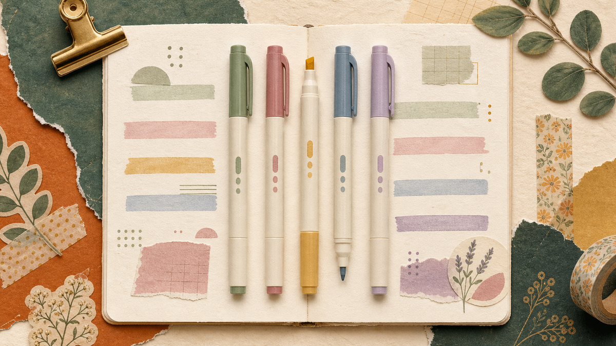
Zebra Mildliner’s muted, pastel-leaning color palette isn’t a stylistic choice made instead of standard fluorescent highlighter colors — it’s a direct response to a real problem: bright fluorescent highlighting causes visual fatigue over long reading or study sessions, and a softer palette is genuinely easier to look at repeatedly without the colors overwhelming the text underneath. This is a functional design decision that happens to also look better in flatlays, not the other way around.
The dual-tip design
Every Mildliner has two tips on opposite ends — a broad chisel tip for standard highlighting and underlining, and a fine bullet tip for detail work, small annotations, or writing directly (the ink is genuinely usable for writing, not just highlighting). This dual-purpose design means one pen replaces both a highlighter and a fine-tip marker for note-taking, which matters more than it sounds like for anyone who annotates heavily — fewer pens to juggle while working through a page.
Why “no bleed” matters more than it seems
Mildliner ink is water-based and formulated specifically to resist bleeding through standard notebook or textbook paper — a real, practical difference from some fluorescent highlighters that visibly show through to the next page, especially on thinner paper. This is one of the more consistently mentioned practical advantages in independent reviews, not just a spec-sheet claim.
How the color sets are organized
Zebra Mildliner sets are typically grouped into color families — “mild & fluorescent,” “deep & warm,” and “cool & refined” being common groupings — rather than sold as a single undifferentiated rainbow set. This makes it easier to pick a cohesive palette for a specific use (color-coding a planner, for example) rather than ending up with 15 colors that don’t visually relate to each other.
A practical color-coding system worth adopting
A common, low-effort system: use 2-3 colors consistently across a notebook or planner (one for deadlines, one for general notes, one for action items) rather than assigning a new color to every category — Mildliner’s muted tones make even heavy multi-color use look organized rather than chaotic, which is a real advantage over bright fluorescent sets when a page ends up with a lot of highlighting.
FAQ: Zebra Mildliner highlighters
Are Mildliner highlighters actually less visually tiring than standard ones? The muted, lower-saturation colors are specifically designed to reduce the visual intensity that causes fatigue during extended reading or study sessions, and this is a commonly reported benefit in user reviews, not just a marketing claim.
Can I write with a Mildliner, or is it only for highlighting? Yes — the fine bullet tip on the opposite end is genuinely usable for writing and detailed annotation, not just highlighting, which is part of why the dual-tip design is useful beyond simple highlighting.
Do Mildliners bleed through notebook paper? Generally no — they’re formulated specifically to resist bleed-through better than many standard fluorescent highlighters, which is one of their most consistently mentioned practical advantages.
How many colors do I actually need to start? A small, consistent set (2-3 colors) used systematically is generally more useful than a large set used inconsistently. Starting with a smaller set and adding colors as a real need emerges is a reasonable approach.